| View previous topic :: View next topic |
| Author |
Message |
SleuCrew
Backside 180


Joined: 20 Aug 2004
Posts: 1577
City: Oak Grove
|
 Posted: Mar 28, 2005 11:27 pm Post subject: Opinions on graphics Posted: Mar 28, 2005 11:27 pm Post subject: Opinions on graphics |
 |
|
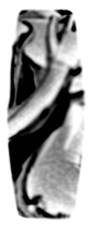
I just want to see what everybody's opinion on this... its very rough and i am still waiting on consent from the original artist, The artist's name is Hajime Sorayama he is from Japan and does alot of insane art... Love it or hate it tell me what you think... keep in mind these are very rough.

|
| Description: |
|
| Filesize: |
40.41 KB |
| Viewed: |
4363 Time(s) |

|
| Description: |
|
| Filesize: |
13.36 KB |
| Viewed: |
4365 Time(s) |
_________________
arson-wake.com |
|
| Back to top |
|
 |
|
|
SleuCrew
Backside 180
Joined: 20 Aug 2004
Posts: 1577
City: Oak Grove
|
| Posted: Mar 28, 2005 11:31 pm Post subject: |
|
|
Ohh yeah.. BTW... The decks are about 98% production ready!
Shouldn't be any more than two months away "hopefully"
_________________
arson-wake.com |
|
| Back to top |
|
|
electricsnow
cassette

Joined: 14 Sep 2003
Posts: 10756
City: Jefferton
|
| Posted: Mar 28, 2005 11:36 pm Post subject: |
|
|
In general, it's a nice piece of art (the detail looks really nice). But for my liking..it's not my favorite. Specifically, I don't like the idea of a robo-cop styled girl on the bottom of my deck...or anything.
I can respect the piece, but you know, my tastes aren't alligned in that direction, if that makes any sense what so ever.
_________________
*The opinions expressed are on my behalf and not those of wakeskating.com* |
|
| Back to top |
|
|
itch
Frontside 180


Joined: 18 Feb 2004
Posts: 471
City: Battle Creek
|
|
| Back to top |
|
|
wakemitch
Frontside Bigspin

Joined: 02 Jun 2004
Posts: 5946
City: Yay Area
|
| Posted: Mar 29, 2005 12:17 am Post subject: |
|
|
| i dont like it as a wakeskate graphic
|
|
| Back to top |
|
|
el
Backside 180

Joined: 07 Oct 2003
Posts: 1739
City: The Sea
|
| Posted: Mar 29, 2005 12:20 am Post subject: |
|
|
I think it's sick as well, but it just doesn't look good on a wakeskate to me.
_________________
 |
|
| Back to top |
|
|
Josh
Frontside 180

Joined: 14 Sep 2003
Posts: 425
City: Melbourne, OZ
|
| Posted: Mar 29, 2005 12:45 am Post subject: |
|
|
I dig it, it's def. different, which is cool. However, it does stir memories of the Parks board graphics for me, which can't be a good thing.
_________________

Integrity
SideSwipe Productions
Wake Euphoria |
|
| Back to top |
|
|
SleuCrew
Backside 180
Joined: 20 Aug 2004
Posts: 1577
City: Oak Grove
|
| Posted: Mar 29, 2005 1:10 am Post subject: |
|
|
I respect all of your opinions, thats why i even posted this...
Any sugestions on what all of you would like to see as the graphic?
Josh, wow.. i never even thought of that until you mentioned it... i dont like the relation either.
_________________
arson-wake.com |
|
| Back to top |
|
|
electricsnow
cassette
Joined: 14 Sep 2003
Posts: 10756
City: Jefferton
|
| Posted: Mar 29, 2005 1:35 am Post subject: |
|
|
You know sleu, I totally respect that these graphics are going to mean something to you, and that the artwork really matters.
It's really hard to say what I would like to see on a wakeskate...there are lots of graphics I really like out there. Whether it be the minimalist style from erich and his team deck, or the sweet c-patterns on the bi-levels, or just other skate graphics that are out there. In my opinion, the wakeboarding industry has a crap load of crappy graphics....I don't know why that is, but whatever. So at any rate, that's why I'm psyched to see that you're really into how the graphics look.
At any rate, maybe start out by finding something that inspires you. I'd look all over for influences...skate graphics, movies, books, etc. Would you like your graphic to have a deeper meaning like the perseverance graphic? You could seriously go all over the place with this. Seriously, I'd highly recommend the book "disposable." You might be inspired by it, since you are now in the position to express yourself through your own products.
And you know, if all else fails, plan b seems to be ripping off other old skate graphics ie. the gonz rip off or the pilfering of the old powell-peralta logo for the phriction. (sarcastic undertone)
_________________
*The opinions expressed are on my behalf and not those of wakeskating.com* |
|
| Back to top |
|
|
Josh
Frontside 180
Joined: 14 Sep 2003
Posts: 425
City: Melbourne, OZ
|
|
| Back to top |
|
|
scott a
"a" is for angel

Joined: 17 Feb 2004
Posts: 4126
|
| Posted: Mar 29, 2005 1:56 am Post subject: |
|
|
not a fan of the robo-chick. im also not really a fan of just placing a pic in the middle like you did. it kinda looks real generic and like you just took some pic and slapped it on the board because you didnt wanna do anything else graphically.
here's something i kinda whipped up real quick. its a bit more abstract, but its different than just slapping a pic on a board and calling it a day. its 5 mins in photoshop so it still looks like poo poo, but whatever. this is bascially me playing with the pic you posted, not necessarily me liking what i just made. i dunno...just throwin ideas out there.
|
| Description: |
|
| Filesize: |
15.72 KB |
| Viewed: |
4279 Time(s) |
_________________
facebook.com/TheLiquidPlayground
www.integrity-wake.com |
|
| Back to top |
|
|
SleuCrew
Backside 180
Joined: 20 Aug 2004
Posts: 1577
City: Oak Grove
|
| Posted: Mar 29, 2005 3:42 am Post subject: |
|
|
Well time to look towards other things, this is what i really wanted was honest opinions about what everybody thinks... I really want to consider everybody's take on the graphics.
My heart and pride are in the design and construction of the decks, i think the graphics in a sense kinda belong to everybody... Thats why i started this thread and asked for everyones opinion.
electricsnow, As you know i am a huge fan of the 80s early 90s skate scene and love most all of the graphics... but i dont want to bite from them as others have done sooo poorly "The Melissa deck" is a discrase to Mark Gonzales in my book.
scott a, That actually reminds me of the LF super squirt or the trip... I was really trying to keep it clean and very simple but i respect where you are coming from.
I thought about doing something like others have done like a graphics contest for a free board... im still kinda considering it.
_________________
arson-wake.com |
|
| Back to top |
|
|
el
Backside 180
Joined: 07 Oct 2003
Posts: 1739
City: The Sea
|
| Posted: Mar 29, 2005 4:11 am Post subject: |
|
|
I'm down... I haven't really shown much of my stuff on this site.
_________________
|
|
| Back to top |
|
|
SleuCrew
Backside 180
Joined: 20 Aug 2004
Posts: 1577
City: Oak Grove
|
| Posted: Mar 29, 2005 4:14 am Post subject: |
|
|
el, if you want throw some shizzle my way, you will get 100% credit for your artwork.
That goes for anybody else too...
_________________
arson-wake.com |
|
| Back to top |
|
|
Grouch
Kickflip


Joined: 16 Feb 2004
Posts: 3146
City: The OC
|
| Posted: Mar 29, 2005 5:36 am Post subject: |
|
|
I really like the artwor. But like everyone else I am not to hip for it on a skate, When I see that I think parks and robo stuff.
_________________
Vive La Jeffe! - JLA is snowboarding!
www.integrity-wake.com |
|
| Back to top |
|
|
Frye
Guest
Joined: 14 Sep 2003
Posts: 3337
|
| Posted: Mar 29, 2005 7:12 am Post subject: |
|
|
wow i really like it. if you could somehow make the picture shiny, like put aluminum foil under the polyurethnae or something idk, and if you would make one like that with the exact same specs as a 03 k39 i would buy alot.
_________________
407-212-7425 |
|
| Back to top |
|
|
Matt_French
Guest
|
| Posted: Mar 29, 2005 9:22 am Post subject: |
|
|
RAD!
Ok...here are my 2 cents...
There is nothing wrong with that graphic IMO...you can make that work.
Here is what I see as being the primary reason why people seem to be reluctant to 'embrace' the design. (for lack of a better word)
From an artistic standpoint...the board design doesnt have balance...there is too much dark (i.e. the black background) that isnt countered by a lighter color/shade---no matter whether you are designing a wakeskate graphic or painting a canvas...a good piece of artwork has to have balance. For the most part, that is why a viewer gets the impression that the caricature was just arbitrarily placed in the middle of the design. Some simple ways to correct that
make the caricature bigger (maybe even overhang the edges), add a more detailed background, use some filler (i.e. random designs or letters) to fill in the black space, etc. There is a lot that can be done. If you like that caricature
stick with it and just message the design around that graphic until you get it just right. Itll take time and patience
and most importantly an open mind. But once you pick a style and a theme that you like (often the hardest part of the whole process)
try not to stray too much from that style
and trust you instincts.
Now if you honestly feel that it may be confused with another design
than that is a whole different. (that happens to me all the time) You have two choices...scrap it...or take it in a different direction and make it completly your own.
|
|
| Back to top |
|
|
warlock
Backside 180

Joined: 20 Jan 2005
Posts: 1503
City: AC
|
| Posted: Mar 29, 2005 10:01 am Post subject: |
|
|
robocop's girlfriend... it's cool.. but i wouldn't want it on the bottom of my wakeskate..... but then again..i'd like the bottom of mine to be tie-dyed so there you go..... 
|
|
| Back to top |
|
|
PIRATE
Guest
|
| Posted: Mar 29, 2005 1:11 pm Post subject: |
|
|
YEAH well here's the thing. if you consider yourself a wakeskater then you shouldn't be concerend about the graphic. the kind of kids that buy a board for the graphic aren't the same kids who support rider owned.
I"ll make you a deal if you make a wakeskate that is good and strong. I"ll ride it you can even paint a picture of a d!ck on the bottom. cause here's the thing, i dont have to look at it.
anywho for all you little label whore kiddies out ther support rider owned or kill yourself either way i win. 
|
|
| Back to top |
|
|
Greg T
Skeezer

Joined: 13 Sep 2003
Posts: 2448
City: ohio
|
| Posted: Mar 29, 2005 1:14 pm Post subject: |
|
|
| argyle. in nerdy colors. i'd buy it.
|
|
| Back to top |
|
|
|
|
|