| View previous topic :: View next topic |
| Author |
Message |
Lollar
360 flip


Joined: 19 Jun 2007
Posts: 8253
|
|
| Back to top |
|
 |
|
|
Evan71
Kickflip

Joined: 22 Aug 2006
Posts: 3045
City: Santa Barbara
|
|
| Back to top |
|
|
Evan71
Kickflip
Joined: 22 Aug 2006
Posts: 3045
City: Santa Barbara
|
 Posted: May 13, 2008 9:26 am Post subject: Posted: May 13, 2008 9:26 am Post subject: |
 |
|
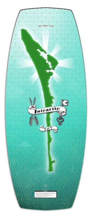
well i gues its repping his hometown but i dont like it
_________________
http://www.bigotebros.com/ |
|
| Back to top |
|
|
cheapskate
Guest
|
| Posted: May 13, 2008 9:26 am Post subject: |
|
|
| not a big fan of it. I prefer the Lemons |
|
| Back to top |
|
|
uidzero
Kickflip
Joined: 01 Jun 2005
Posts: 3839
City: Casselberry
|
| Posted: May 13, 2008 9:28 am Post subject: |
|
|
I like the colors...
_________________
-Paul |
|
| Back to top |
|
|
JB_CANSKATE
Backside 180

Joined: 06 Jul 2004
Posts: 1622
City: Markham, Ontario
|
| Posted: May 13, 2008 9:28 am Post subject: |
|
|
Love the colours, not so much the graphic. That board is too small for me anyways.
I WANT TO TRY A BAMBOO LEMONs. |
|
| Back to top |
|
|
Lollar
360 flip
Joined: 19 Jun 2007
Posts: 8253
|
| Posted: May 13, 2008 9:28 am Post subject: |
|
|
Its Anna Maria Island. Thats tight. I would get the whole state of FL tho...
_________________
http://www.wakeskateclips.com/
Last edited by Lollar on May 13, 2008 9:30 am; edited 1 time in total |
|
| Back to top |
|
|
-=AlexXx=-
Pillage & Plunder

Joined: 09 Aug 2004
Posts: 17488
City: yes
|
| Posted: May 13, 2008 9:29 am Post subject: |
|
|
| i really like it. the color is beautiful. I like the representation of AMI. goods great. |
|
| Back to top |
|
|
bachlonso
Backside 180

Joined: 02 Jul 2007
Posts: 670
City: NFA
|
| Posted: May 13, 2008 9:29 am Post subject: |
|
|
rather ugly compared to the old graphics!
dosn't have that unique integ'ish look to it. weird... |
|
| Back to top |
|
|
TannerC
Backside 180
Joined: 17 Mar 2005
Posts: 1694
City: Nanaimo
|
| Posted: May 13, 2008 9:30 am Post subject: |
|
|
Island Style.
I think it's sick. Build your own scene. |
|
| Back to top |
|
|
pipo
Backside 180
Joined: 13 Oct 2004
Posts: 1214
City: 0172
|
| Posted: May 13, 2008 9:33 am Post subject: |
|
|
| I don't like it. It's missing ''it'' |
|
| Back to top |
|
|
brassmonkey
Backside 180

Joined: 14 Aug 2007
Posts: 2479
City: sarasota
|
| Posted: May 13, 2008 9:37 am Post subject: |
|
|
Mixed feelings. I love reppin of AMI or heaven if you want to call it that. But it's missing the intellectual mystery mind fvck.
_________________
The promise of heaven out of reach.
With expectations he couldn't meet
But David found a way to jump the line
A back door into a life divine. |
|
| Back to top |
|
|
-Supra-
Frontside 180


Joined: 08 Nov 2007
Posts: 356
City: Orlando
|
| Posted: May 13, 2008 9:40 am Post subject: |
|
|
| I dont really like it. It looks too plain compared to the 06 TNT. The Lemons looks tight though |
|
| Back to top |
|
|
electricsnow
cassette

Joined: 14 Sep 2003
Posts: 10756
City: Jefferton
|
| Posted: May 13, 2008 9:42 am Post subject: |
|
|
haha, that was funny brass monkey. Allegory is part of what you're missing.
I like the colors. They're very soothing. For some reason, my favorites are still the old ones, especially the tolstoy and the perseverance, but this one is cool for different reasons.
_________________
*The opinions expressed are on my behalf and not those of wakeskating.com* |
|
| Back to top |
|
|
JEFFE
Grouch
Joined: 20 Feb 2008
Posts: 266
City: Sesame Street
|
| Posted: May 13, 2008 9:55 am Post subject: |
|
|
I like it, but not nearly as much as the Lemons...It wont matter, because nobody sees the bottom of my board anyways.  |
|
| Back to top |
|
|
Kay-Kay
Backside 180
Joined: 31 Dec 2004
Posts: 559
City: can't pick just one
|
| Posted: May 13, 2008 10:31 am Post subject: |
|
|
| The thing I like about this is years decks is that each deck has the same bottom pattern that wraps around to the top of the deck. For the TNT in particular, I'm gonna have to agree with everyone else. Cool colors, and it's cool to represent you home but it just doesn't seem to match up with the crazy cool graphics integrity has put out in the past. But then again, I'm sure the photo doesn't do the board justice so I'd really have to see it in person. |
|
| Back to top |
|
|
wakemitch
Frontside Bigspin

Joined: 02 Jun 2004
Posts: 5946
City: Yay Area
|
| Posted: May 13, 2008 10:35 am Post subject: |
|
|
| There are a lot of details that this image isnt showing. |
|
| Back to top |
|
|
Poo
Guest
|
| Posted: May 13, 2008 10:50 am Post subject: |
|
|
i like the island being on there, not so much the glowing rays behind it, they seem kinda out of place, but i love how the background fades from one pattern to the next so smoothly and with that slight gradient, its awesome  |
|
| Back to top |
|
|
ride5
Frontside 180

Joined: 14 Oct 2003
Posts: 325
City: san jo
|
| Posted: May 13, 2008 10:55 am Post subject: |
|
|
It may be a little differn't from our other graffix. It repersents what Nick loves and is true to his heart. since he is a part of Integrity, it is a Integrity graffic. I support his choice 100%. hate it or love it, but dont bash it...
_________________
at least be honest with your self |
|
| Back to top |
|
|
electricsnow
cassette
Joined: 14 Sep 2003
Posts: 10756
City: Jefferton
|
| Posted: May 13, 2008 10:55 am Post subject: |
|
|
well, maybe there's a connection between the two decks, becuase those "rays" are the same ones that emanate from the mutiny heart on lemons' deck.
It's like rick mccrank holding up a maple leaf and putting it where his heart is and says "my heart." (substitute the maple leaf for AMI) I don't remember what video that was in. But maybe I'm just making a big deal out of this!
_________________
*The opinions expressed are on my behalf and not those of wakeskating.com* |
|
| Back to top |
|
|
|
|
|